Revel
Revel
Born in the heart of Ojai and rooted in high-frequency living, Revel is a next-generation beverage brand creating small-batch drinks that restore, uplift, and delight. What began as Revel Kombucha evolved into something much bigger: a playful, soulful lineup of lifeforce beverages brewed with intention and infused with place. The brief? Build a brand that honors the land, the people, and the spirit of the valley — then bottle that magic in every sip.

Research
Research
Partnering with founders Sonia and Adam Gallegos, we discovered a brand rich in intention: each beverage is crafted from locally‑sourced, small‑batch ingredients designed to nourish body and soul. Revel’s evolution from kombucha to a broader lifeforce lineup demanded a name and identity that could grow across formats, flavors, and experiences—while celebrating its hometown origins and community roots in Ojai.
Partnering with founders Sonia and Adam Gallegos, we discovered a brand rich in intention: each beverage is crafted from locally‑sourced, small‑batch ingredients designed to nourish body and soul. Revel’s evolution from kombucha to a broader lifeforce lineup demanded a name and identity that could grow across formats, flavors, and experiences—while celebrating its hometown origins and community roots in Ojai.
Research
Partnering with founders Sonia and Adam Gallegos, we discovered a brand rich in intention: each beverage is crafted from locally‑sourced, small‑batch ingredients designed to nourish body and soul. Revel’s evolution from kombucha to a broader lifeforce lineup demanded a name and identity that could grow across formats, flavors, and experiences—while celebrating its hometown origins and community roots in Ojai.
Design
Design
The new visual system is playful yet grounded, designed to grow with the brand’s expanding range:
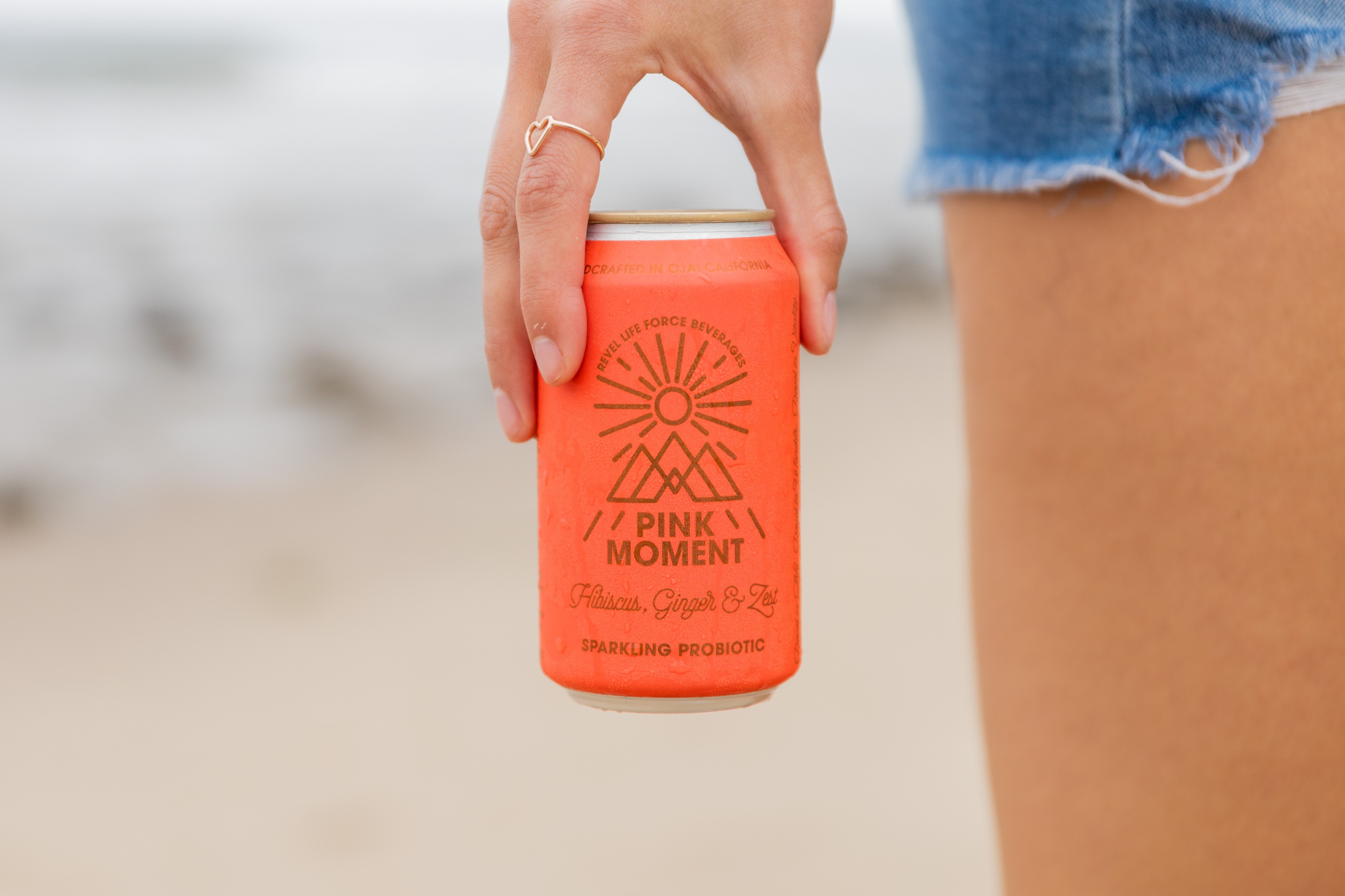
Pink Moment: A vibrant pink can featuring clean bronze line art of the Topa Topa Mountains—a tribute to Ojai’s iconic local landscape.
Om: An elegant, vibrational pattern rendered in tone-on-tone metallics—reflecting the spiritual depth and calm-energy of the Ojai Valley.
Hoppy Valley: A whimsical nod to “Happy Valley” with illustrated local bunnies and old-summer-camp charm—a fun, family‑friendly flavor note.
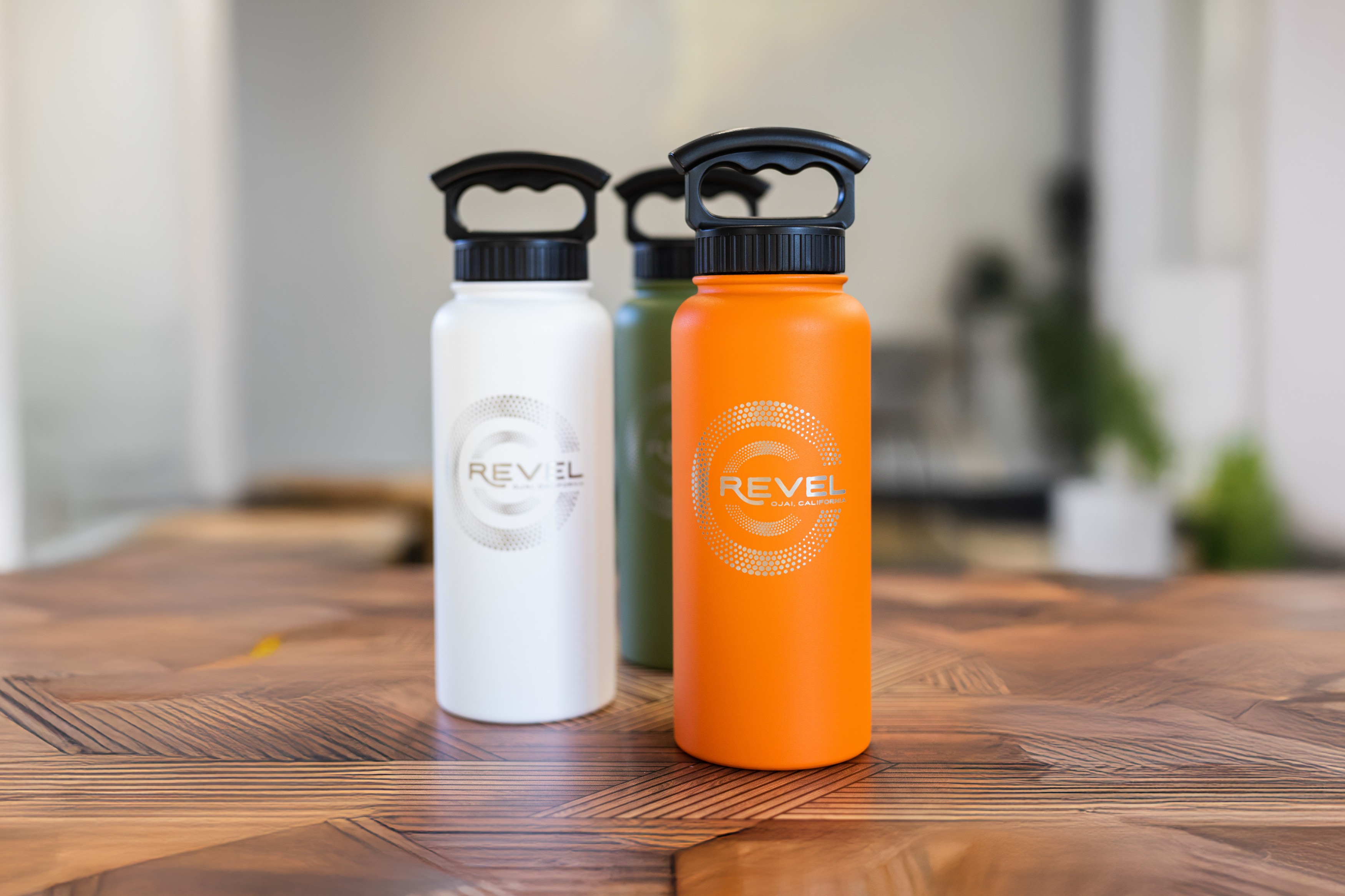
The logo and packaging feature warm metallic linework, approachable typography, and custom illustrations across the range.
The new visual system is playful yet grounded, designed to grow with the brand’s expanding range:
Pink Moment: A vibrant pink can featuring clean bronze line art of the Topa Topa Mountains—a tribute to Ojai’s iconic local landscape.
Om: An elegant, vibrational pattern rendered in tone-on-tone metallics—reflecting the spiritual depth and calm-energy of the Ojai Valley.
Hoppy Valley: A whimsical nod to “Happy Valley” with illustrated local bunnies and old-summer-camp charm—a fun, family‑friendly flavor note.
The logo and packaging feature warm metallic linework, approachable typography, and custom illustrations across the range.
Design
The new visual system is playful yet grounded, designed to grow with the brand’s expanding range:
Pink Moment: A vibrant pink can featuring clean bronze line art of the Topa Topa Mountains—a tribute to Ojai’s iconic local landscape.
Om: An elegant, vibrational pattern rendered in tone-on-tone metallics—reflecting the spiritual depth and calm-energy of the Ojai Valley.
Hoppy Valley: A whimsical nod to “Happy Valley” with illustrated local bunnies and old-summer-camp charm—a fun, family‑friendly flavor note.
The logo and packaging feature warm metallic linework, approachable typography, and custom illustrations across the range.
Development
Development
A flexible brand system was built to support long-term growth and evolving product lines:
Packaging: Three flagship cans launched with distinct illustrated identities — unified by layout, color discipline, and visual hierarchy.
Design Language: Bright, grounded, and joyfully alive. From taglines to graphic rhythm, every element reinforces Revel’s mission to live with presence and vitality.
Guidelines: A comprehensive brand manual covering color, illustration, typography, voice, and usage — built to scale with new flavors, SKUs, and retail opportunities.
Development
A flexible brand system was built to support long-term growth and evolving product lines:
Packaging: Three flagship cans launched with distinct illustrated identities — unified by layout, color discipline, and visual hierarchy.
Design Language: Bright, grounded, and joyfully alive. From taglines to graphic rhythm, every element reinforces Revel’s mission to live with presence and vitality.
Guidelines: A comprehensive brand manual covering color, illustration, typography, voice, and usage — built to scale with new flavors, SKUs, and retail opportunities.

Concept
Concept
Revel Lifeforce Beverages celebrates vitality as a way of life—infusing every can with the spirit of Ojai, emotional energy, and joyful momentum. It’s a brand built to support aliveness: playful, rooted, and always moving toward the good. Each blend is a reminder to revel in the moment and drink deeply from what makes life feel full.
Revel Lifeforce Beverages celebrates vitality as a way of life—infusing every can with the spirit of Ojai, emotional energy, and joyful momentum. It’s a brand built to support aliveness: playful, rooted, and always moving toward the good. Each blend is a reminder to revel in the moment and drink deeply from what makes life feel full.
Concept
Revel Lifeforce Beverages celebrates vitality as a way of life—infusing every can with the spirit of Ojai, emotional energy, and joyful momentum. It’s a brand built to support aliveness: playful, rooted, and always moving toward the good. Each blend is a reminder to revel in the moment and drink deeply from what makes life feel full.

More Works More Works
More Works More Works