Ojai Valley Brewery
Ojai Valley Brewery
Ojai Valley Brewery is built on connection — to land, season, and culture. With unfiltered Ojai well water as its base and native botanicals at its core, every brew is shaped by place. Drawing from a background in culinary craft, OVB brings a farm-to-glass philosophy to brewing: hyper-local, hands-on, and quietly alchemical. Our role was to translate that spirit into a distinct, scalable brand rooted in story and sensory depth.
Research
Research
We began with immersive fieldwork — stepping into the rhythms of the brewery, meeting the founders, and mapping the sensory landscape of their beer. Each recipe is an expression of the valley: foraged ingredients, seasonal cycles, and careful technique. Beyond flavor, there was a guiding idea — to brew with the same intentionality as a chef or winemaker. Competitive audits revealed a gap in the regional craft beer space: no one was tapping into Ojai’s mystique or honoring its unique terroir. This clarity shaped the brand’s foundation.
We began with immersive fieldwork — stepping into the rhythms of the brewery, meeting the founders, and mapping the sensory landscape of their beer. Each recipe is an expression of the valley: foraged ingredients, seasonal cycles, and careful technique. Beyond flavor, there was a guiding idea — to brew with the same intentionality as a chef or winemaker. Competitive audits revealed a gap in the regional craft beer space: no one was tapping into Ojai’s mystique or honoring its unique terroir. This clarity shaped the brand’s foundation.
Research
We began with immersive fieldwork — stepping into the rhythms of the brewery, meeting the founders, and mapping the sensory landscape of their beer. Each recipe is an expression of the valley: foraged ingredients, seasonal cycles, and careful technique. Beyond flavor, there was a guiding idea — to brew with the same intentionality as a chef or winemaker. Competitive audits revealed a gap in the regional craft beer space: no one was tapping into Ojai’s mystique or honoring its unique terroir. This clarity shaped the brand’s foundation.

Design
Design
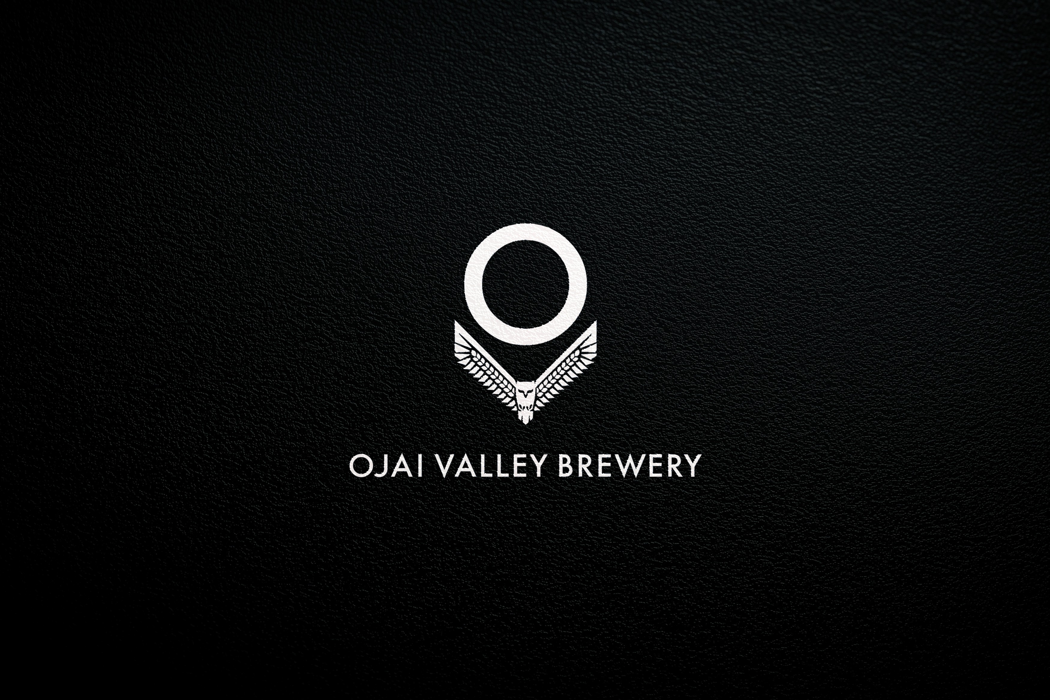
The brand centers on the Owl Motif — wings outstretched beneath a full moon, forming the letters O and V for Ojai Valley. A closer look reveals feathers rendered as shafts of wheat, connecting the visual identity back to ancient brewing and earthbound ritual. The palette draws from the local environment — stone, sage, citrus, and indigo — while hand-drawn textures and symbols evoke forest floors and moonlit skies. Typography bridges heritage and modernity, giving the system both soul and structure.
The brand centers on the Owl Motif — wings outstretched beneath a full moon, forming the letters O and V for Ojai Valley. A closer look reveals feathers rendered as shafts of wheat, connecting the visual identity back to ancient brewing and earthbound ritual. The palette draws from the local environment — stone, sage, citrus, and indigo — while hand-drawn textures and symbols evoke forest floors and moonlit skies. Typography bridges heritage and modernity, giving the system both soul and structure.
Design
The brand centers on the Owl Motif — wings outstretched beneath a full moon, forming the letters O and V for Ojai Valley. A closer look reveals feathers rendered as shafts of wheat, connecting the visual identity back to ancient brewing and earthbound ritual. The palette draws from the local environment — stone, sage, citrus, and indigo — while hand-drawn textures and symbols evoke forest floors and moonlit skies. Typography bridges heritage and modernity, giving the system both soul and structure.
Development
Development
The visual identity was extended into a complete brand ecosystem — built to scale, adapt, and stay rooted in story.
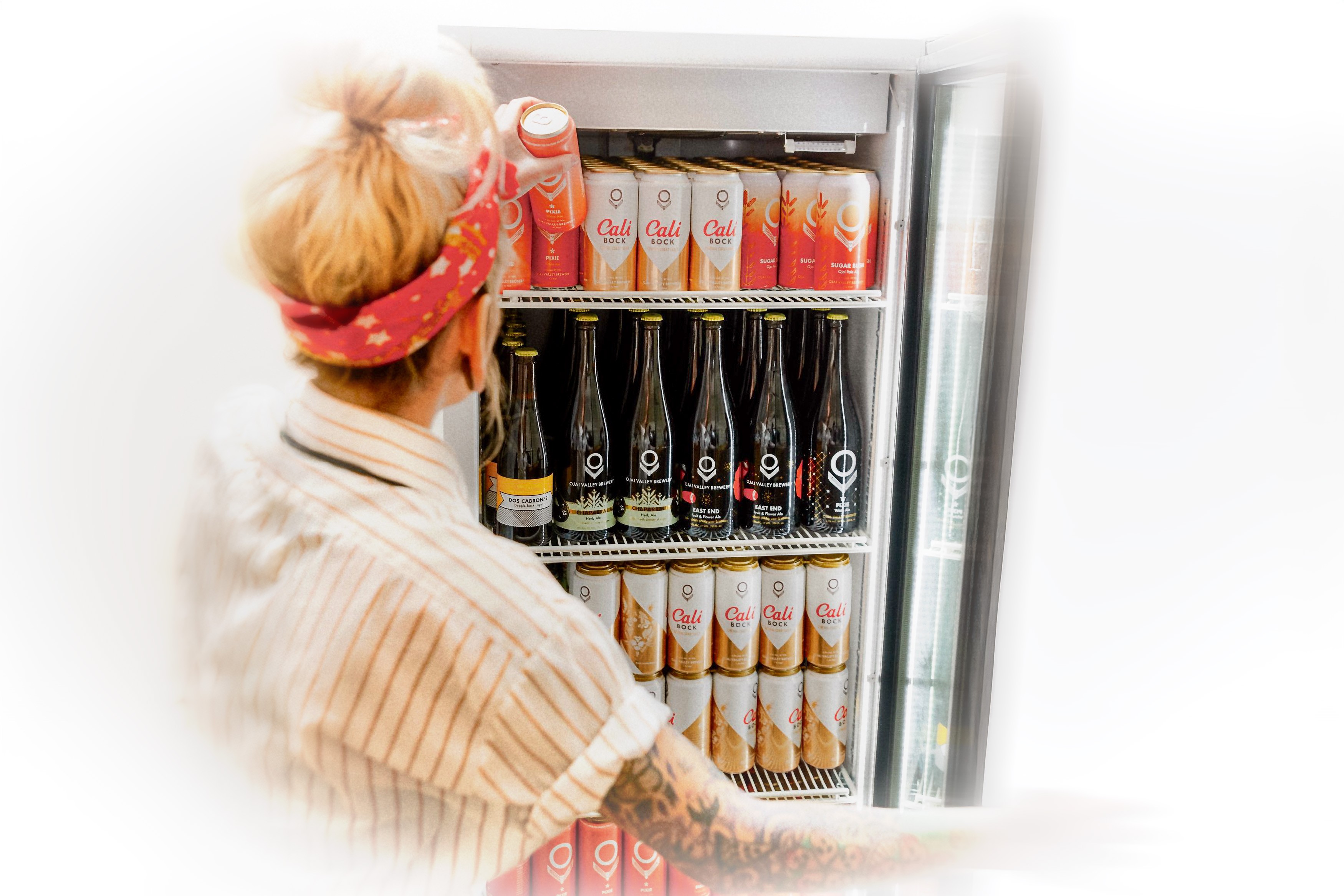
Packaging: A dual format system — etched glass bottles and matte aluminum cans — wrapped in original linework inspired by Mesopotamian forms and Ojai’s native landscape. The result feels both ancient and immediate, symbolic and site-specific.
Iconography: The Owl Motif, lunar phases, and custom glyphs form a symbolic toolkit used across packaging, tap handles, signage, and digital.
Voice: Clear, grounded, and sensory in tone — shaped to connect with both the local community and Ojai’s design-aware visitors.
Collateral & Merch: Tactile, thoughtful pieces including screen-printed apparel, etched coasters, hand-finished menus, and recycled fiber totes.
Guidelines: A lean brand system designed for flexibility — ensuring new brews, seasonal releases, and community events all carry forward the same visual and narrative integrity.
The visual identity was extended into a complete brand ecosystem — built to scale, adapt, and stay rooted in story.
Packaging: A dual format system — etched glass bottles and matte aluminum cans — wrapped in original linework inspired by Mesopotamian forms and Ojai’s native landscape. The result feels both ancient and immediate, symbolic and site-specific.
Iconography: The Owl Motif, lunar phases, and custom glyphs form a symbolic toolkit used across packaging, tap handles, signage, and digital.
Voice: Clear, grounded, and sensory in tone — shaped to connect with both the local community and Ojai’s design-aware visitors.
Collateral & Merch: Tactile, thoughtful pieces including screen-printed apparel, etched coasters, hand-finished menus, and recycled fiber totes.
Guidelines: A lean brand system designed for flexibility — ensuring new brews, seasonal releases, and community events all carry forward the same visual and narrative integrity.
Development
The visual identity was extended into a complete brand ecosystem — built to scale, adapt, and stay rooted in story.
Packaging: A dual format system — etched glass bottles and matte aluminum cans — wrapped in original linework inspired by Mesopotamian forms and Ojai’s native landscape. The result feels both ancient and immediate, symbolic and site-specific.
Iconography: The Owl Motif, lunar phases, and custom glyphs form a symbolic toolkit used across packaging, tap handles, signage, and digital.
Voice: Clear, grounded, and sensory in tone — shaped to connect with both the local community and Ojai’s design-aware visitors.
Collateral & Merch: Tactile, thoughtful pieces including screen-printed apparel, etched coasters, hand-finished menus, and recycled fiber totes.
Guidelines: A lean brand system designed for flexibility — ensuring new brews, seasonal releases, and community events all carry forward the same visual and narrative integrity.

Concept
Concept
Ojai Valley Brewery operates at the intersection of nature, craft, and community. Each brew captures the culture of the land — in both senses of the word: the living organisms that ferment and the lived experience that surrounds them. This is a brand shaped by place and practice, where every detail reflects the valley’s rhythm, flavor, and quiet magic. Brewing becomes a cultural act — rooted in earth, shared in good company.
Ojai Valley Brewery operates at the intersection of nature, craft, and community. Each brew captures the culture of the land — in both senses of the word: the living organisms that ferment and the lived experience that surrounds them. This is a brand shaped by place and practice, where every detail reflects the valley’s rhythm, flavor, and quiet magic. Brewing becomes a cultural act — rooted in earth, shared in good company.
Concept
Ojai Valley Brewery operates at the intersection of nature, craft, and community. Each brew captures the culture of the land — in both senses of the word: the living organisms that ferment and the lived experience that surrounds them. This is a brand shaped by place and practice, where every detail reflects the valley’s rhythm, flavor, and quiet magic. Brewing becomes a cultural act — rooted in earth, shared in good company.
More Works More Works
More Works More Works

