CAPRI HOTEL
CAPRI HOTEL
Capri Hotel channels postwar optimism with a wink—reviving mid-century fun through a contemporary lens. Our challenge was to create a brand that felt both nostalgically playful and sharply relevant for today’s city-slick travelers. We delivered a logo, palette, and visual system that evoke the era’s atomic age exuberance while keeping the experience fresh, curated, and undeniably hip.
Research
Research
We immersed ourselves in 1950s and ’60s Southern California iconography—vintage travel posters, atomic-era signage, and classic motel neon. We interviewed hotel staff and frequent guests to understand Capri’s unique personality: part neighborhood dive, part retro playground. Competitive audits of boutique hotels revealed a gap—no local property was leaning fully into joyful nostalgia. That insight became the springboard for everything from color choices to merchandise concepts.
We immersed ourselves in 1950s and ’60s Southern California iconography—vintage travel posters, atomic-era signage, and classic motel neon. We interviewed hotel staff and frequent guests to understand Capri’s unique personality: part neighborhood dive, part retro playground. Competitive audits of boutique hotels revealed a gap—no local property was leaning fully into joyful nostalgia. That insight became the springboard for everything from color choices to merchandise concepts.
Research
We immersed ourselves in 1950s and ’60s Southern California iconography—vintage travel posters, atomic-era signage, and classic motel neon. We interviewed hotel staff and frequent guests to understand Capri’s unique personality: part neighborhood dive, part retro playground. Competitive audits of boutique hotels revealed a gap—no local property was leaning fully into joyful nostalgia. That insight became the springboard for everything from color choices to merchandise concepts.
Design
Design
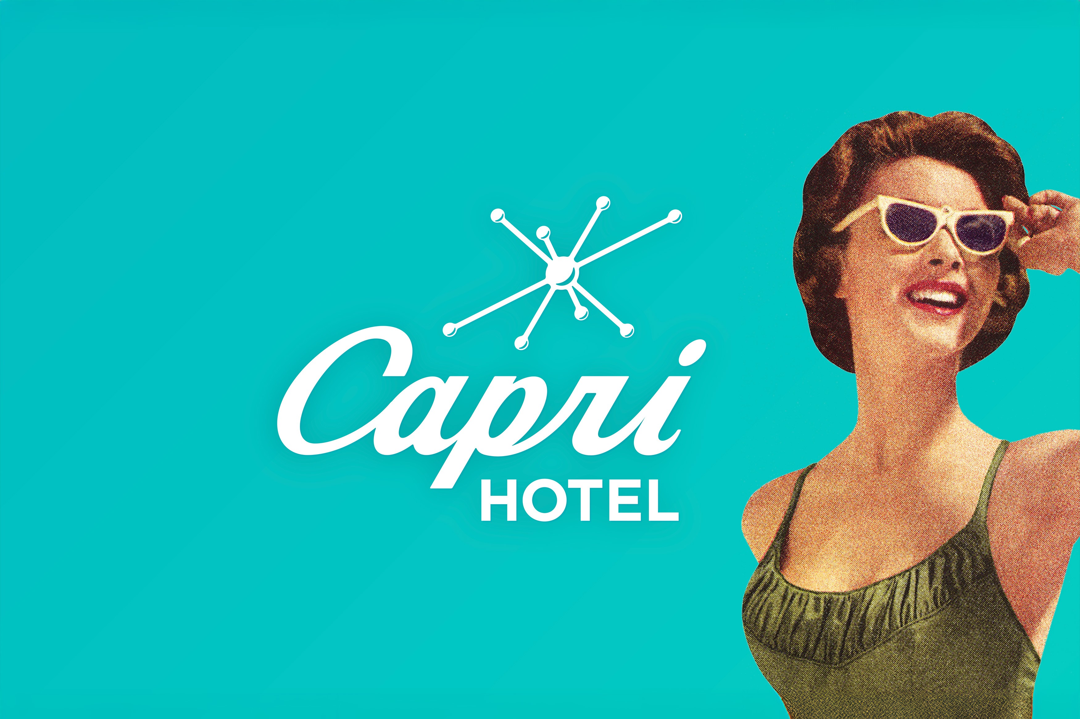
The capstone is a starburst logo—its radiating lines recall classic mid-century “space age” motifs and the effervescence of a well-shaken cocktail. A vibrant teal base paired with cream and coral accents channels Palm Springs poolside chic. The hand illustrated typography fuses a soft script (“Capri”) with a clean, geometric sans-serif (“Hotel”), balancing warmth and precision. Photography treatments emphasize high-contrast lighting, grain-reminiscent textures, and candid moments that feel like a sunset-lit velvet curtain rising on a retro road trip.
The capstone is a starburst logo—its radiating lines recall classic mid-century “space age” motifs and the effervescence of a well-shaken cocktail. A vibrant teal base paired with cream and coral accents channels Palm Springs poolside chic. The hand illustrated typography fuses a soft script (“Capri”) with a clean, geometric sans-serif (“Hotel”), balancing warmth and precision. Photography treatments emphasize high-contrast lighting, grain-reminiscent textures, and candid moments that feel like a sunset-lit velvet curtain rising on a retro road trip.
Design
The capstone is a starburst logo—its radiating lines recall classic mid-century “space age” motifs and the effervescence of a well-shaken cocktail. A vibrant teal base paired with cream and coral accents channels Palm Springs poolside chic. The hand illustrated typography fuses a soft script (“Capri”) with a clean, geometric sans-serif (“Hotel”), balancing warmth and precision. Photography treatments emphasize high-contrast lighting, grain-reminiscent textures, and candid moments that feel like a sunset-lit velvet curtain rising on a retro road trip.
Development
Development
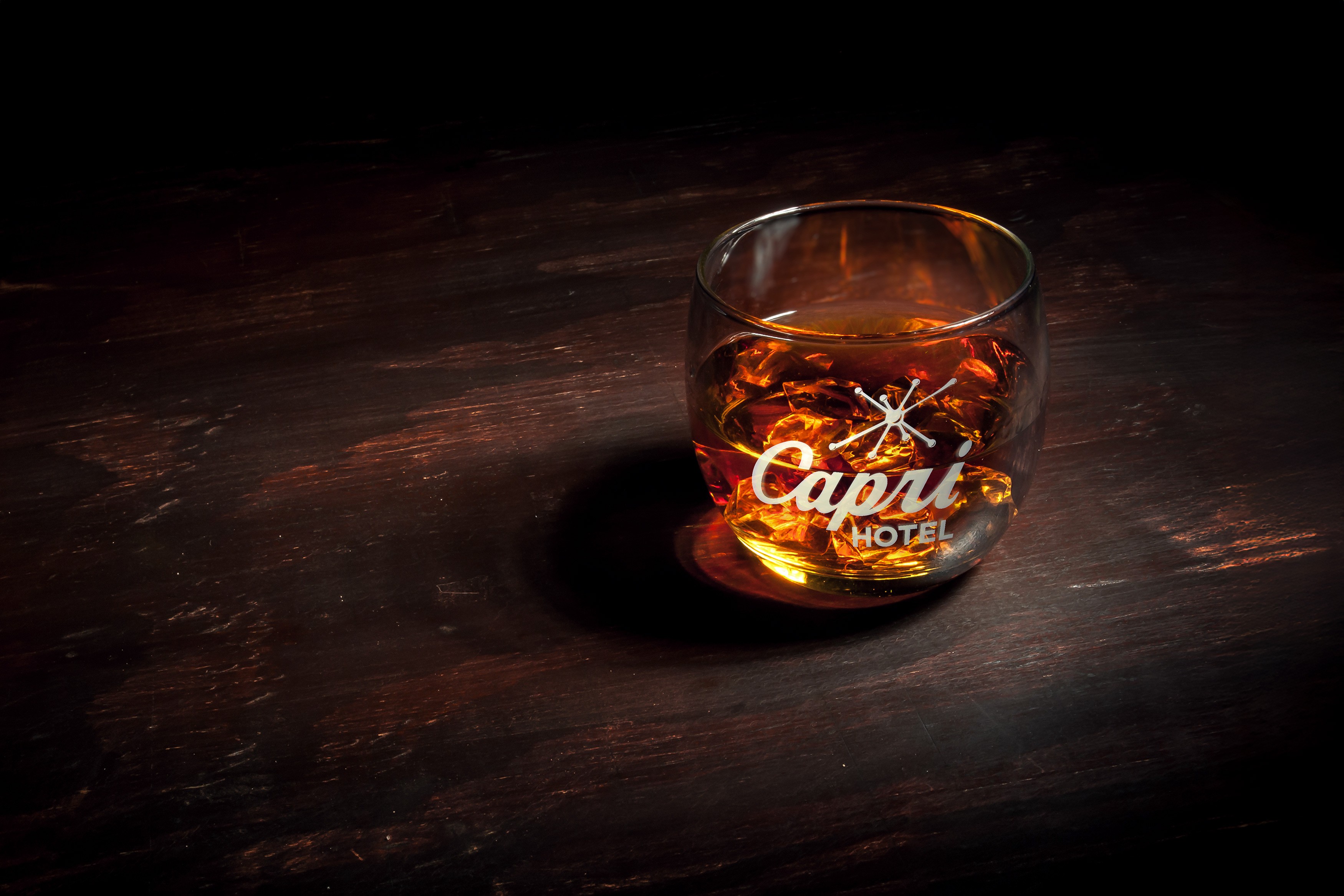
To bring the system to life, we handcrafted everything from billboards to barware.
Billboards & Signage: Oversized starbursts and bold teal fields appear on street-facing hoardings and the iconic neon pole sign, ensuring visibility day and night.
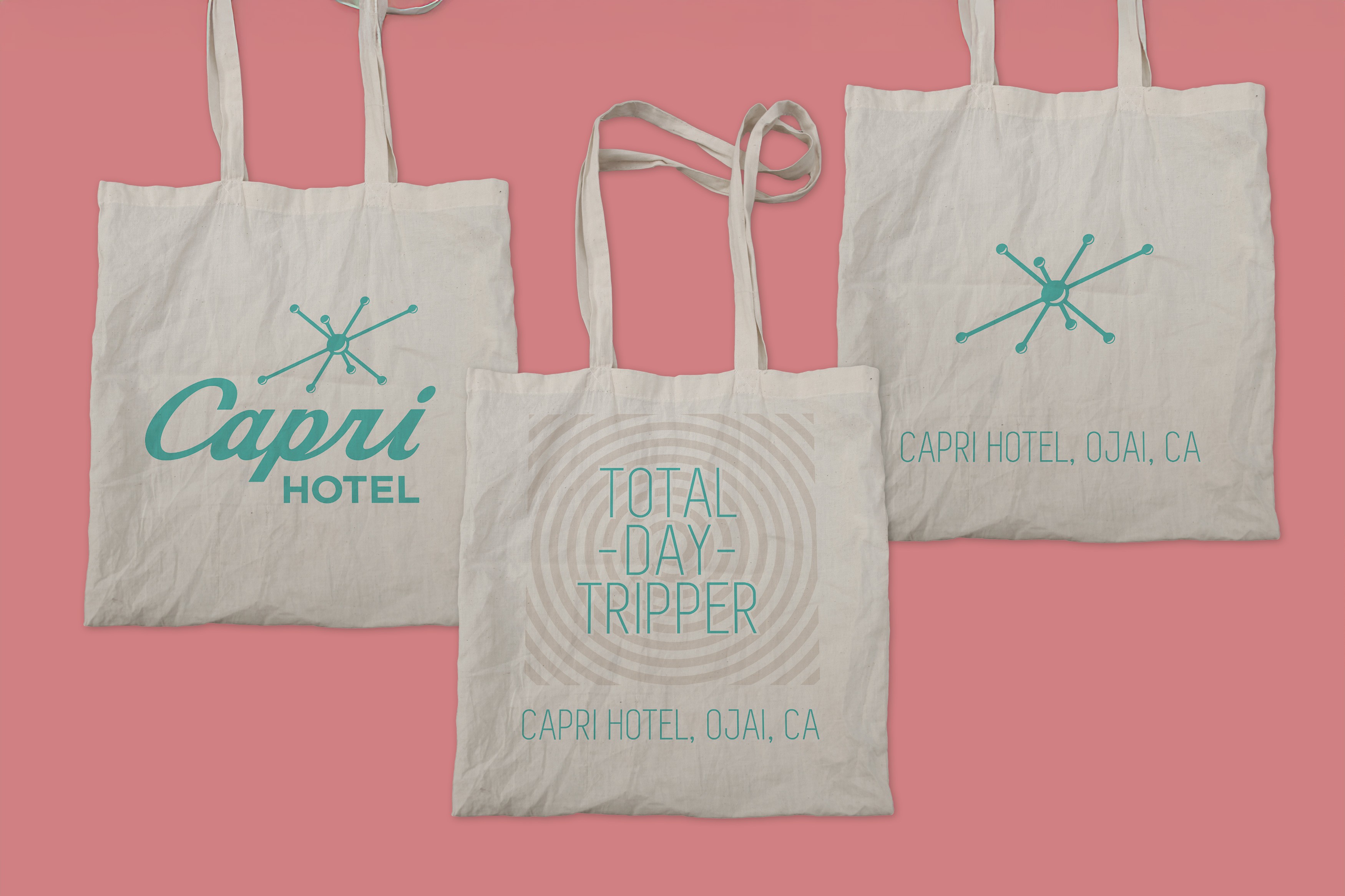
Merch & Barware: Totes, glassware, and coasters feature the starburst and logo in metallic leaf, echoing the atomic-age sparkle; cocktail napkins carry playful taglines like “Sip the Sun.”
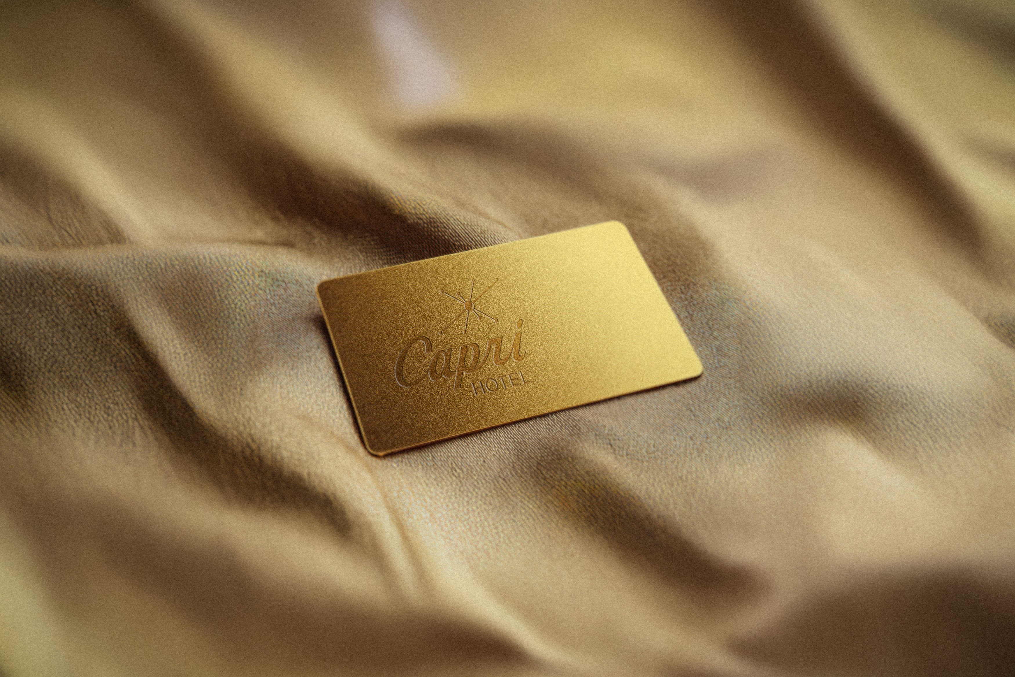
Print Collateral: Room key cards, menus, and a fold-out city guide all share consistent graphic flourishes—atomic halos, minimal grid layouts, and pops of coral.
To bring the system to life, we handcrafted everything from billboards to barware.
Billboards & Signage: Oversized starbursts and bold teal fields appear on street-facing hoardings and the iconic neon pole sign, ensuring visibility day and night.
Merch & Barware: Totes, glassware, and coasters feature the starburst and logo in metallic leaf, echoing the atomic-age sparkle; cocktail napkins carry playful taglines like “Sip the Sun.”
Print Collateral: Room key cards, menus, and a fold-out city guide all share consistent graphic flourishes—atomic halos, minimal grid layouts, and pops of coral.
Development
To bring the system to life, we handcrafted everything from billboards to barware.
Billboards & Signage: Oversized starbursts and bold teal fields appear on street-facing hoardings and the iconic neon pole sign, ensuring visibility day and night.
Merch & Barware: Totes, glassware, and coasters feature the starburst and logo in metallic leaf, echoing the atomic-age sparkle; cocktail napkins carry playful taglines like “Sip the Sun.”
Print Collateral: Room key cards, menus, and a fold-out city guide all share consistent graphic flourishes—atomic halos, minimal grid layouts, and pops of coral.
Concept
Concept
Optimism is the ultimate luxury. By weaving classic mid-century motifs—starbursts, teal sunsets, playful type—into every touchpoint, Capri Hotel invites guests to step into a world where nostalgia and modernity collide. It’s a brand that doesn’t merely reference an era; it resurrects its zest, encouraging everyone who checks in to embrace joy, sunshine, and the spirit of endless summer.
Optimism is the ultimate luxury. By weaving classic mid-century motifs—starbursts, teal sunsets, playful type—into every touchpoint, Capri Hotel invites guests to step into a world where nostalgia and modernity collide. It’s a brand that doesn’t merely reference an era; it resurrects its zest, encouraging everyone who checks in to embrace joy, sunshine, and the spirit of endless summer.
Concept
Optimism is the ultimate luxury. By weaving classic mid-century motifs—starbursts, teal sunsets, playful type—into every touchpoint, Capri Hotel invites guests to step into a world where nostalgia and modernity collide. It’s a brand that doesn’t merely reference an era; it resurrects its zest, encouraging everyone who checks in to embrace joy, sunshine, and the spirit of endless summer.
More Works More Works
More Works More Works